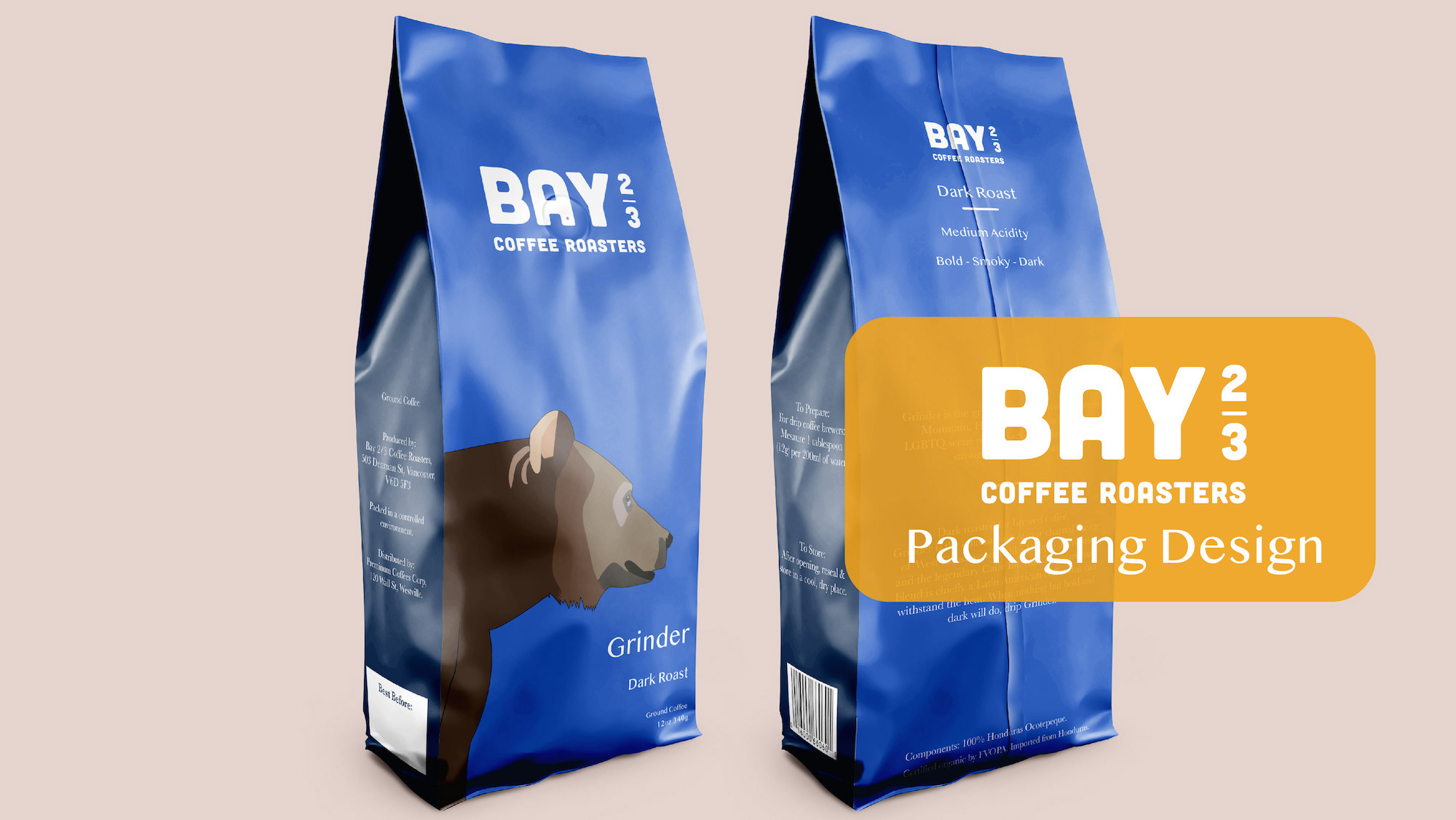
Designing menus for evening dining & wine. For both print and digital viewing platforms.
Moonlit Table's unique aspect: Italian meets North American cuisine, served until midnight
Ambiance: Dimly lit, lots of candles, vines and plants hang from the ceiling to give the impression of evening dining outdoors in Italy.
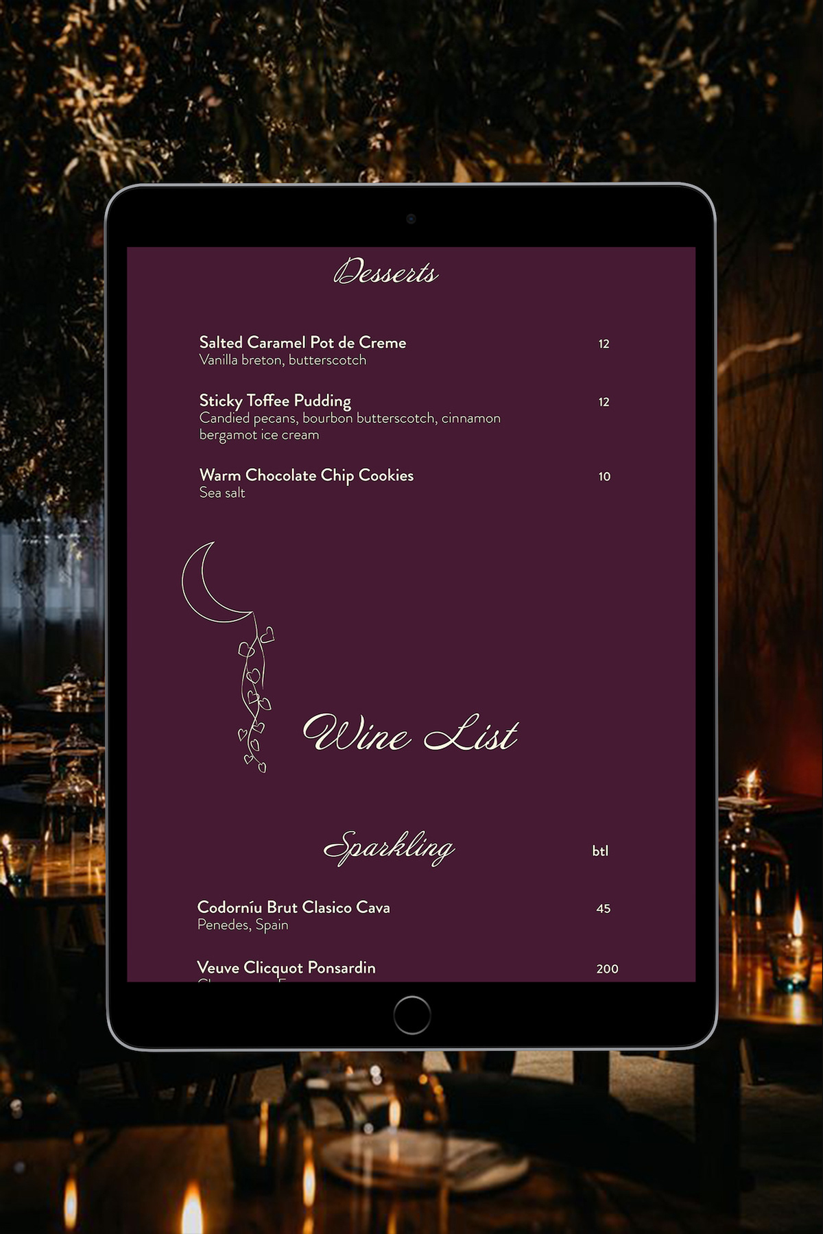
Constraints: With dim lighting inside the restaurant, how can the menu be visible and easily read? The iPad version must not be too bright and create harsh light, which would ruin the romantic lighting of the room.
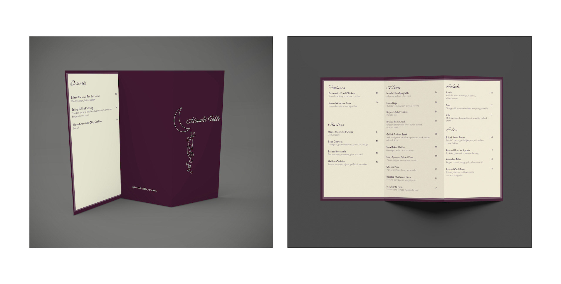
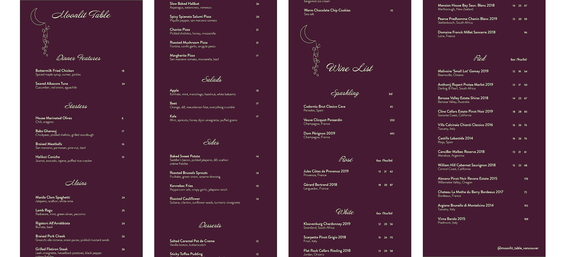
Typeface: Moonlit Table has a sense of elegance and romance that lends itself to the script font, Annabelle, which flows from one letter to the next.
For menu items, clarity is needed; the clean, thin lettering of Brandon Grotesque also reflects the modernity of the restaurant brand.
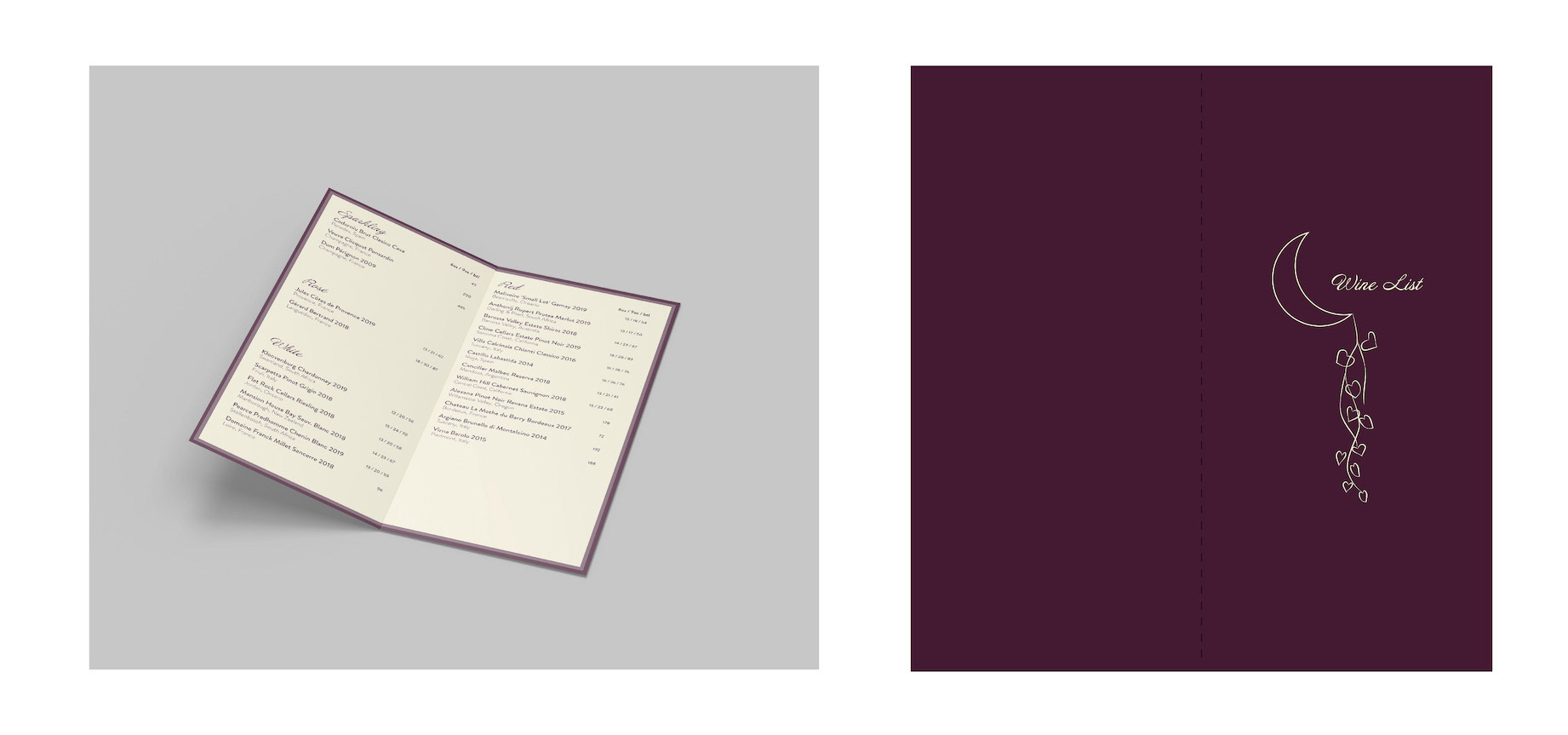
Colour scheme: Rich purple gives the feeling of opulence and wealth, contrasting well with the colour of clotted cream. Together they evoke the idea of a luxury dining experience.
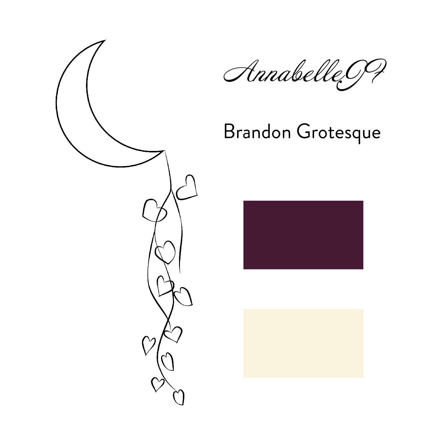
Purple: #451A33
Cream: #FAF3DD
The logo design of a moon and heart-shaped hanging plant, represents the interior of the restaurant, where plants hang from the ceiling, along with the restaurant name, of Moonlit Table.
Digital Version: The dark coloured background with contrasting text allows for iPad readability, without upsetting the dim atmosphere for the restaurant.
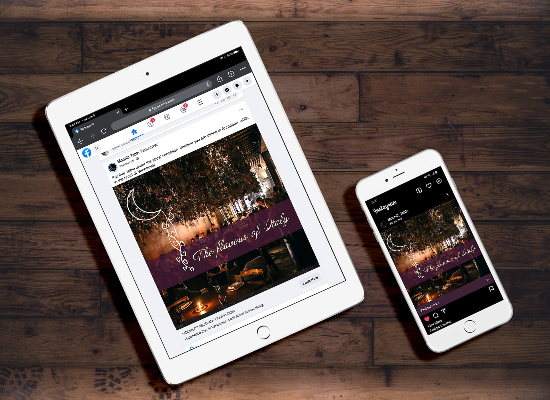
Ad campaign: Moonlit Table’s advertisement campaign reflects the romantic ambiance of the establishment, while highlighting the restaurant’s atmosphere of Italian dining.
Programs used: Adobe InDesign, Adobe Illustrator & Adobe Photoshop.