MPA Society is a non-profit that helps people who are living with mental illnesses and who need housing, legal aid and other low-income related services.
Challenge: The existing MPA Society brand has very little online/social presence. How to increase brand awareness for the charity, so that those in need know where to go for help, and so those who may want to donate know what this non-profit does?
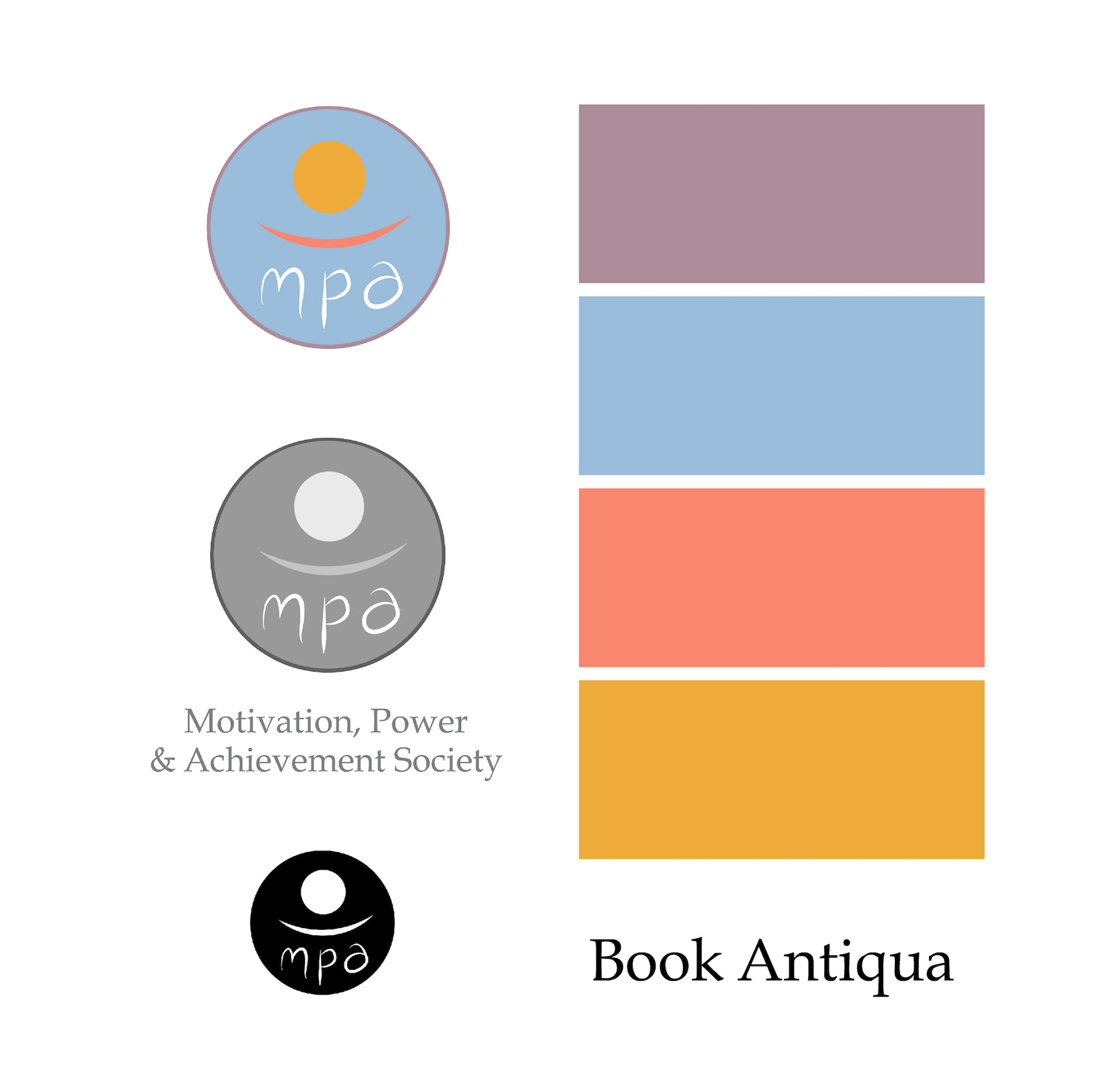
Logo:
Abstract and minimalist design, reducing a complex organisation purpose down to the bare aspects of positivity and humanity.
The yellow sunshine represents: life, optimism, inspiration, positivity, warmth.
The salmon pink smile represents: happiness, humanity, giving, mental health.
The circular badge design represents: unity, an engaging and positive shape connected with family and people.
Colour Scheme: Soft, uplifting and reassuring. They reflect the comfort and welcoming warmth of MPA Society.
Lilac: # AD8C9A
Blue: # 99BDDB
Salmon: #F98770
Yellow: #EFAC3A
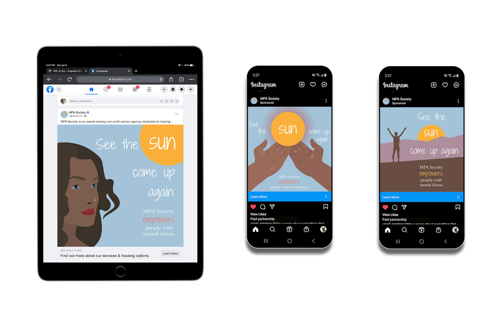
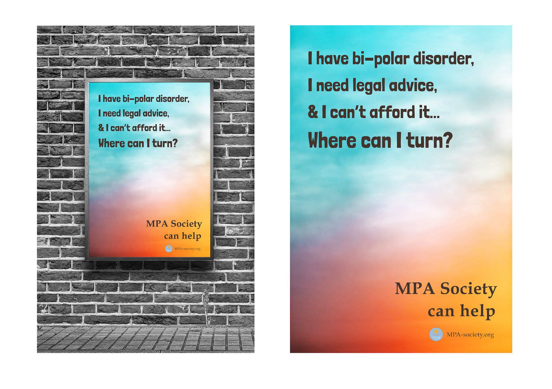
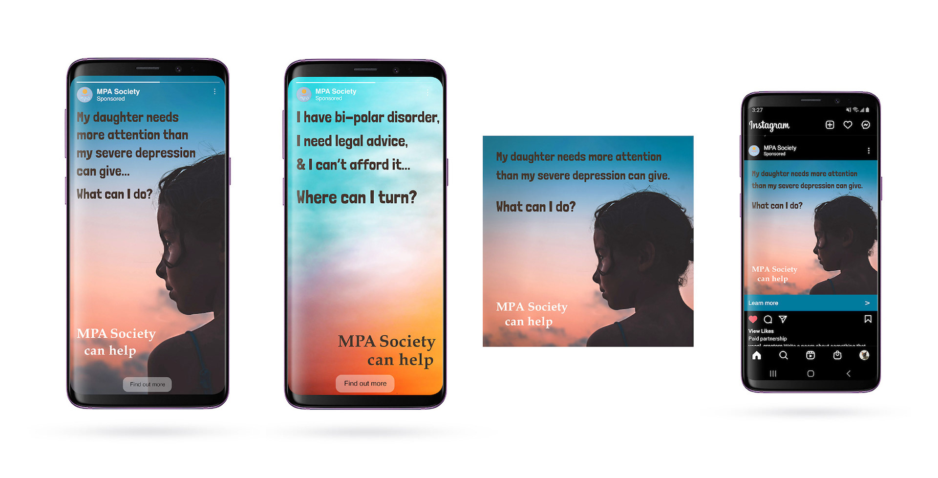
2nd Ad Campaign: ‘MPA Society Can Help’ text forward ads, using colours from the branding and showing the viewer the circumstances of people who can benefit from MPA’s services. The idea is to show MPA Society as the answer to these people's problems. The ads are bright and attractive to draw the viewer’s attention.
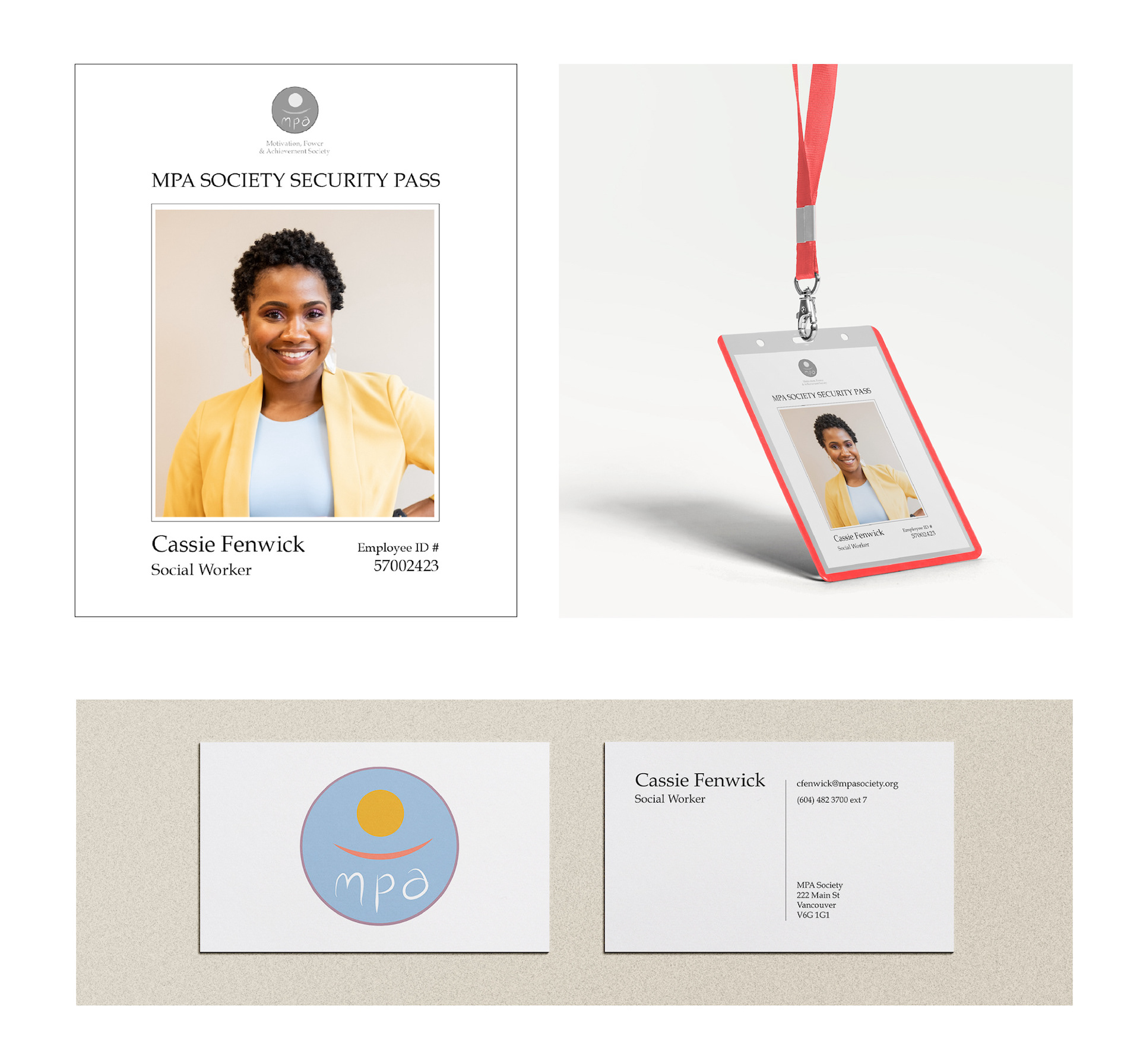
Branded employee accessories
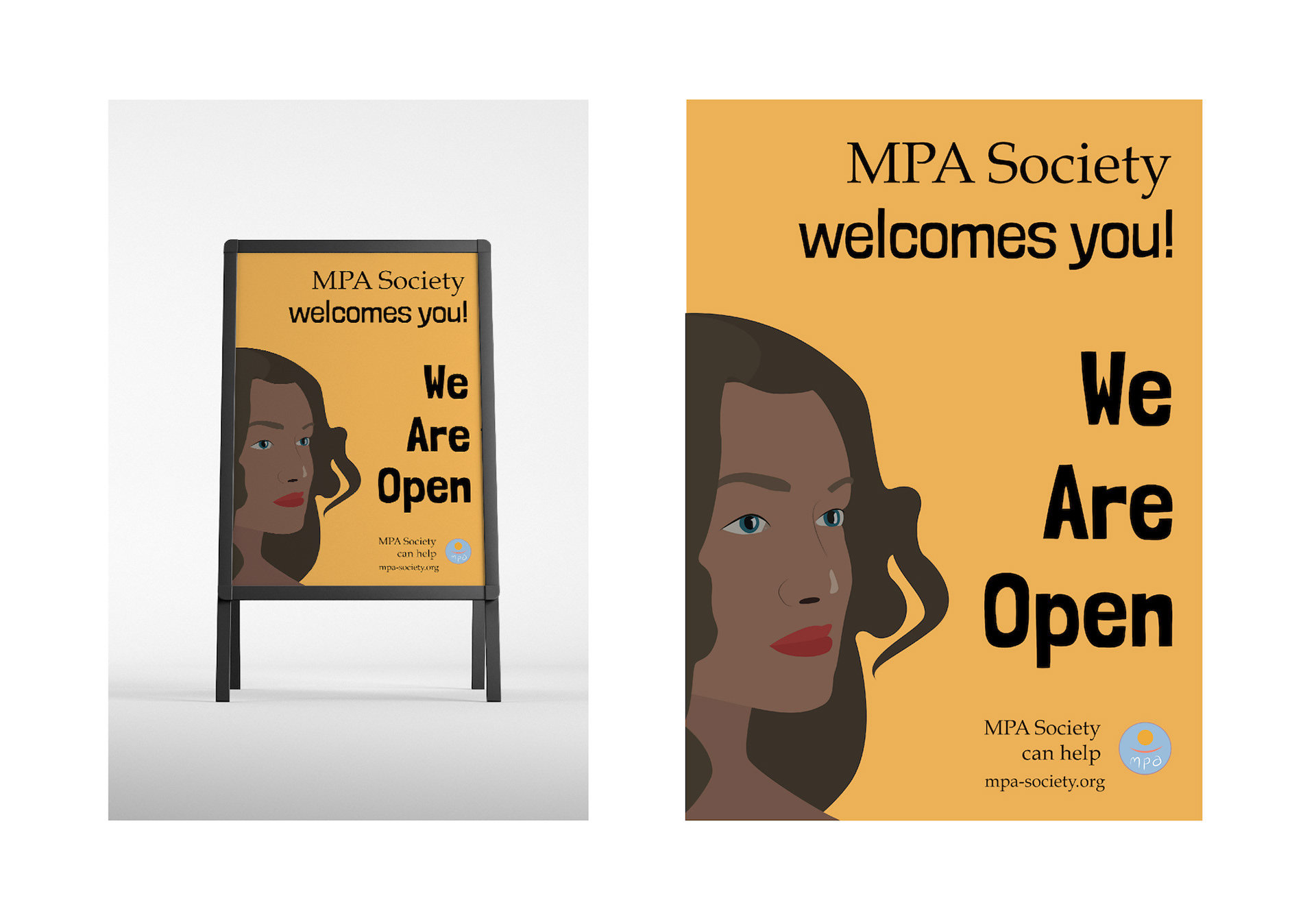
A poster design for the A-frame that sits outside of an MPA Society social centre, where people can find help & information on the services offered, or meet with other users. It is bright, welcoming and clear, with brand colours and the attractive illustration from an advertising campaign.
Programs used: Adobe Illustrator, Adobe Photoshop