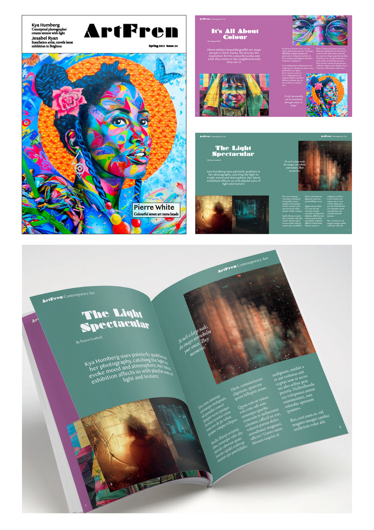
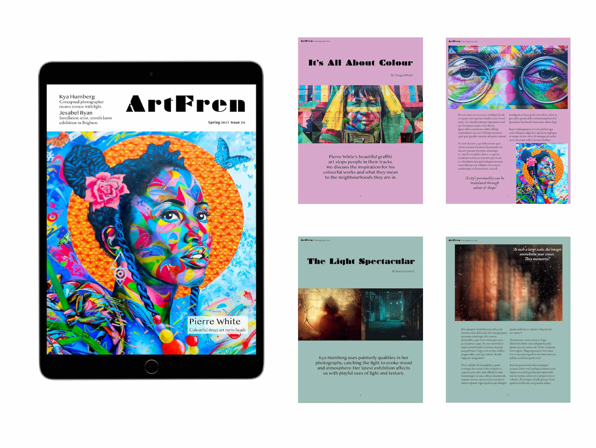
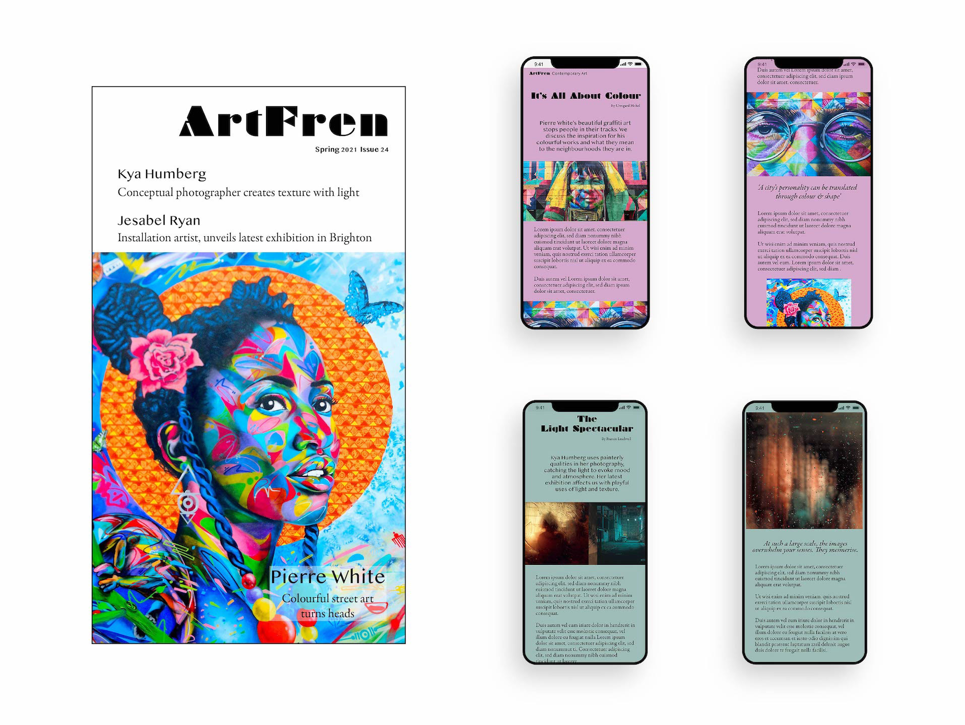
ArtFren Contemporary Art is an attractive, bold, modern magazine aimed at artists and creative types, but it is also engaging and inviting enough to attract a wider audience. The articles feature conceptual artists with eye-catching artwork displayed on pages coloured to reflect elements of the artwork. The magazine is available in print format, as well as digital format for the iPad & phone. An ad campaign was also produced.
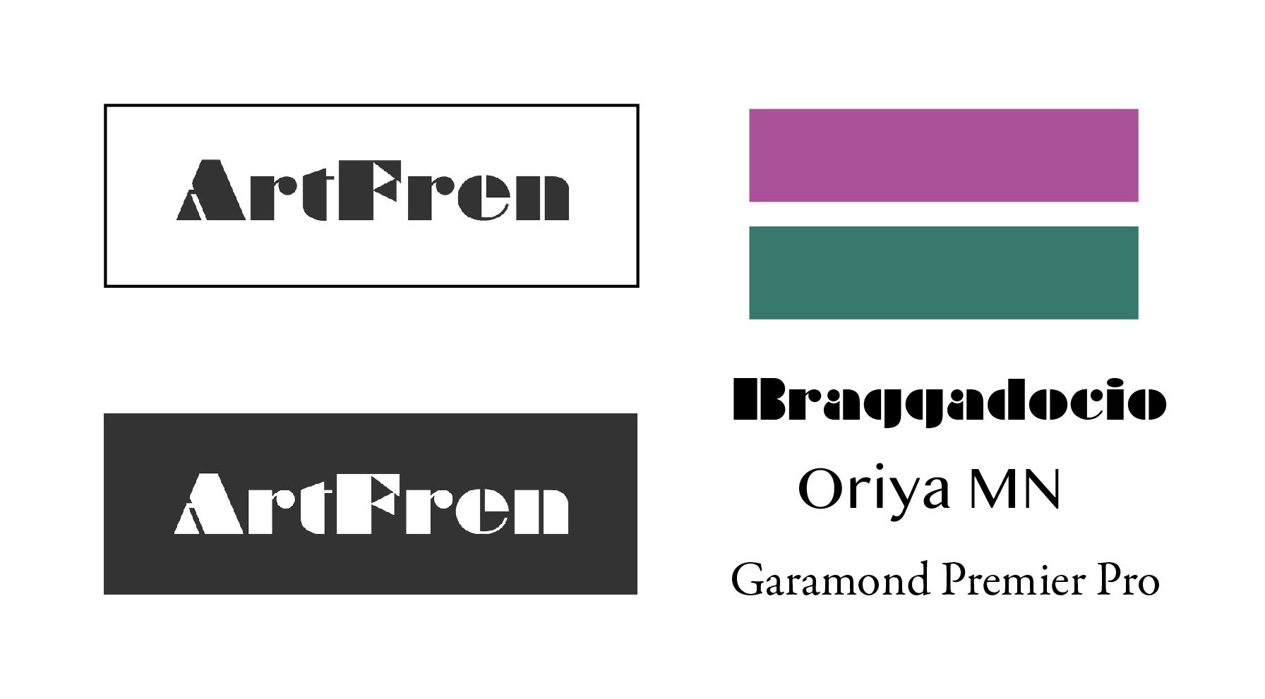
The sans font of this logo has a bold and art-deco like expression. It uses block shapes to create lettering and gives a unique and bold artistic style for the magazine.
Colour scheme:
Purple #AB5199
Green #37796D
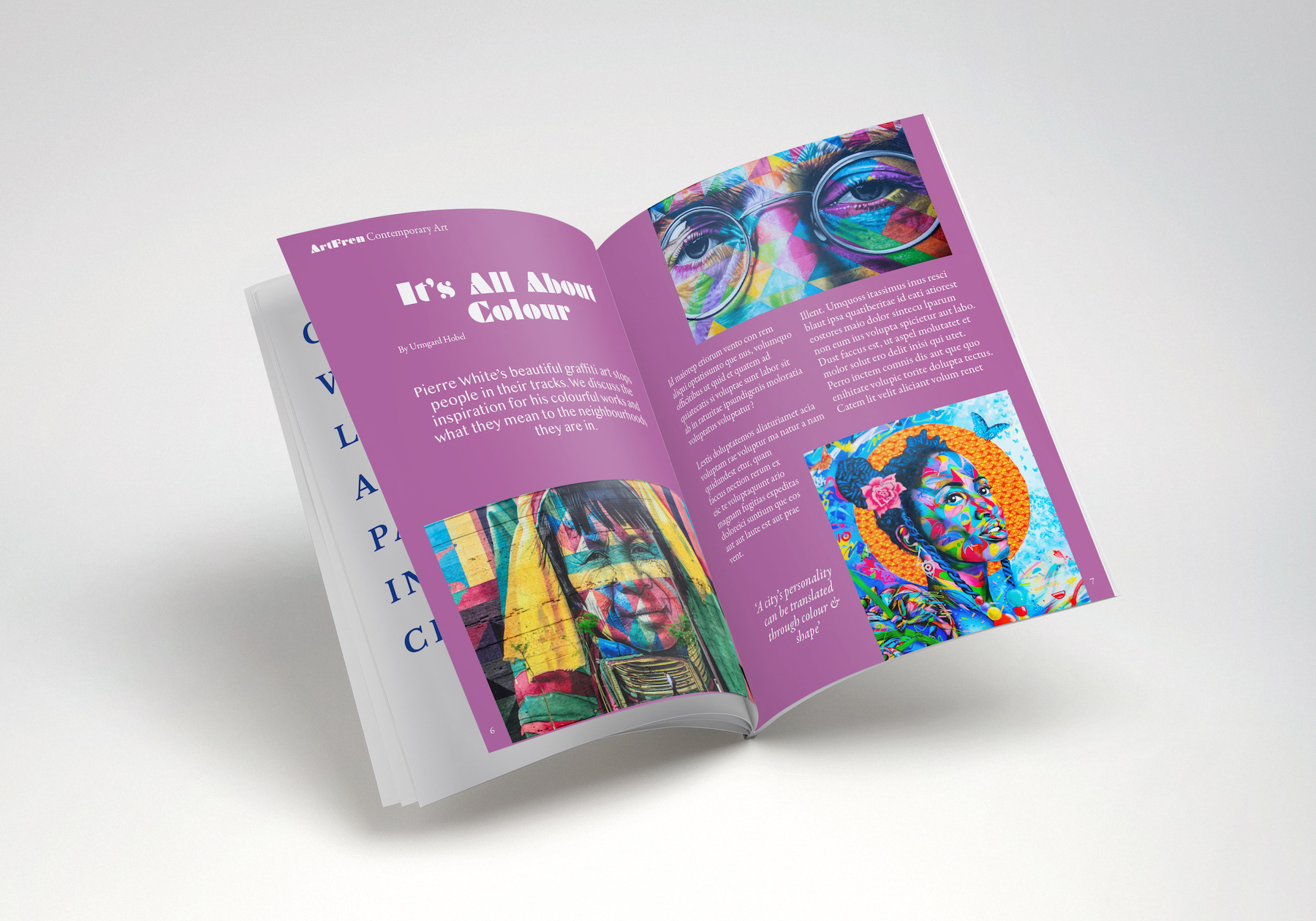
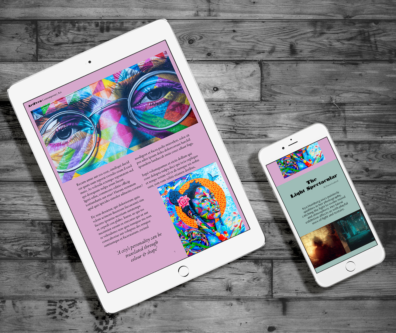
For a contemporary art magazine, colour and vibrancy is crucial to attract customers. I chose a bright and striking picture for the front page and for each article to have a colour scheme relating to one of the artworks within.
Print Version: Photographs of the artwork bleed off the page and defy text margins, prompting the idea of a rule-breaking style of magazine. Text is generously spaced here, to allow for easy reading.
The iPad version: coloured backgrounds are toned down to allow for readability on the device. Font size is increased and columns reduced down from 3 to 2, to allow for a more enjoyable user reading experience.
The iPhone version: Font size is increased to an easy reading size for the phone and columns reduced down to 1. Photos span across the screen, breaking up text and encouraging the user to keep scrolling.
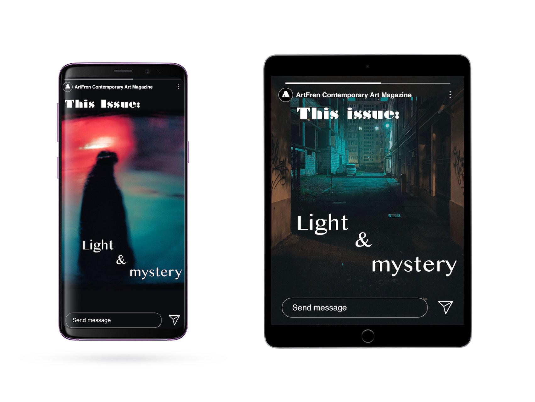
An ad campaign running on Instagram & Facebook 'stories', invites viewers to find out more about the
‘Light & Mystery’ involved in the intriguing artworks shown.
‘Light & Mystery’ involved in the intriguing artworks shown.
This will link to the ArtFren social page, where users can find the magazine for download or delivery.
Programs used: Adobe Illustrator, Adobe Photoshop, Adobe InDesign.