A local coffee shop in the West End of downtown Vancouver is looking for branded packaging designs and an accompanying advertising campaign, with some accessories.
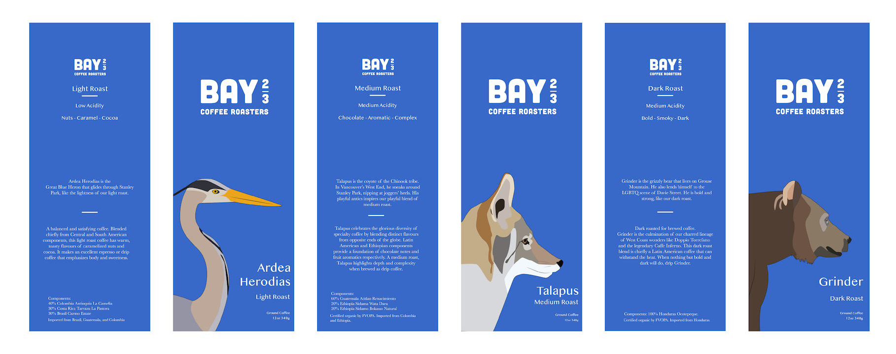
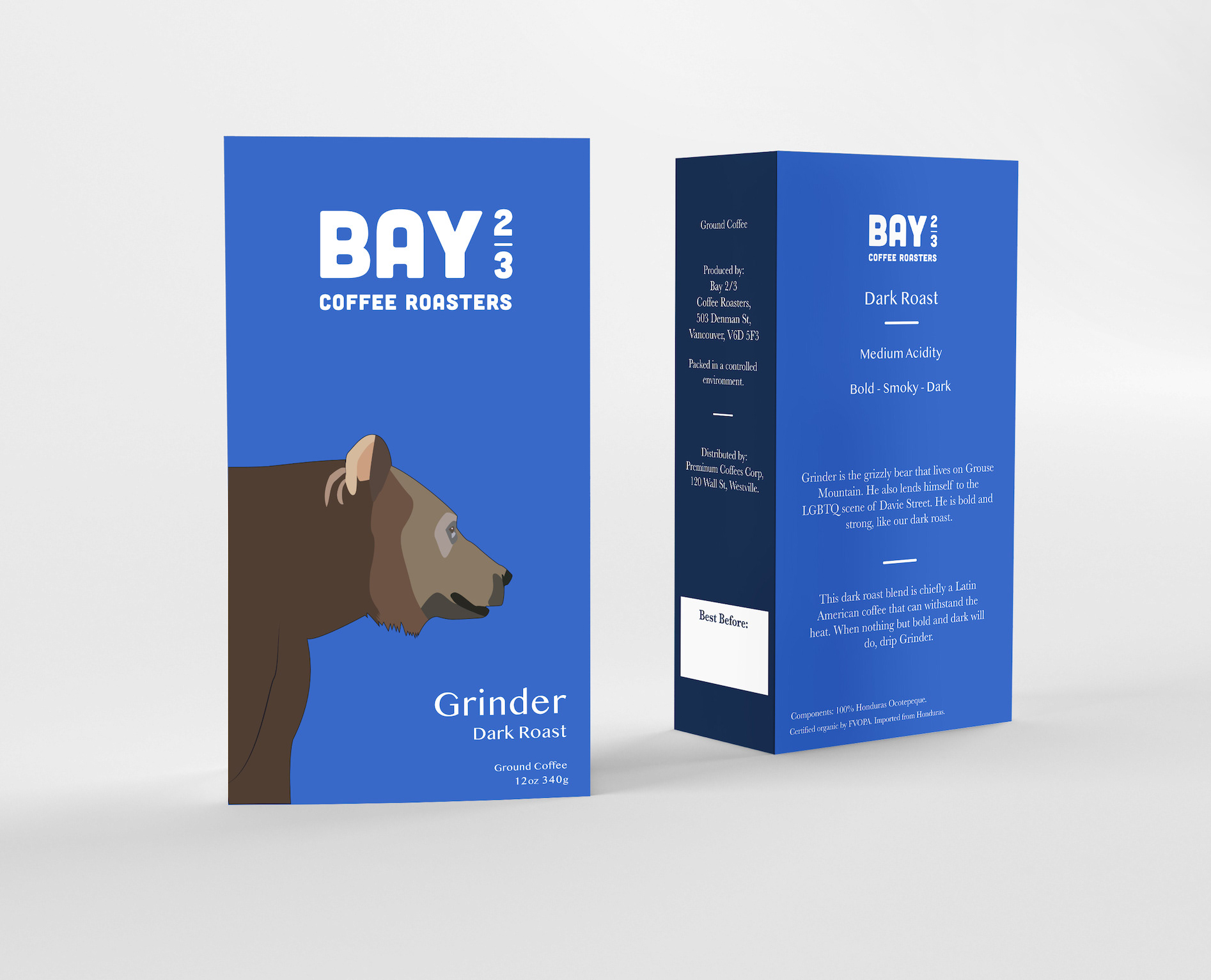
The coffee shop is located in a popular tourist destination, so the branding needs to be bold and stand out against the competition. Bay ⅔ embraces its location by honouring some local wildlife on its packaging bag & box designs.
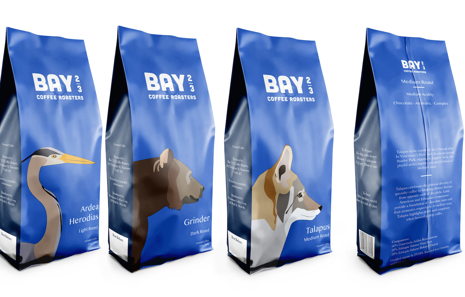
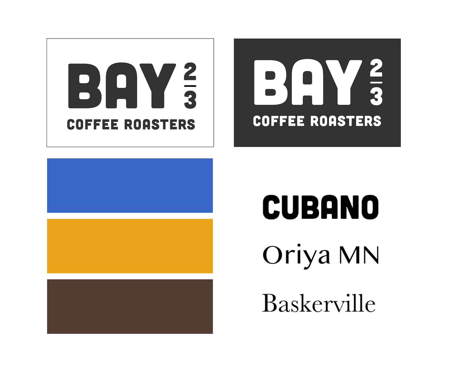
Hand drawn, original illustrations created specifically for this brand. Branding assets for Bay ⅔ are bold, modern, clear and attractive. The typefaces are striking, neat & easy to read for effective packaging design.
The split complementary colour scheme is fresh and modern and, coupled with the animal illustrations, give customers a sense of the West End culture.
Colour scheme:
Blue #3869C9
Yellow #EBA51A
Brown #503E33
Branding Concept: All three animals represent aspects of the West End in Vancouver:
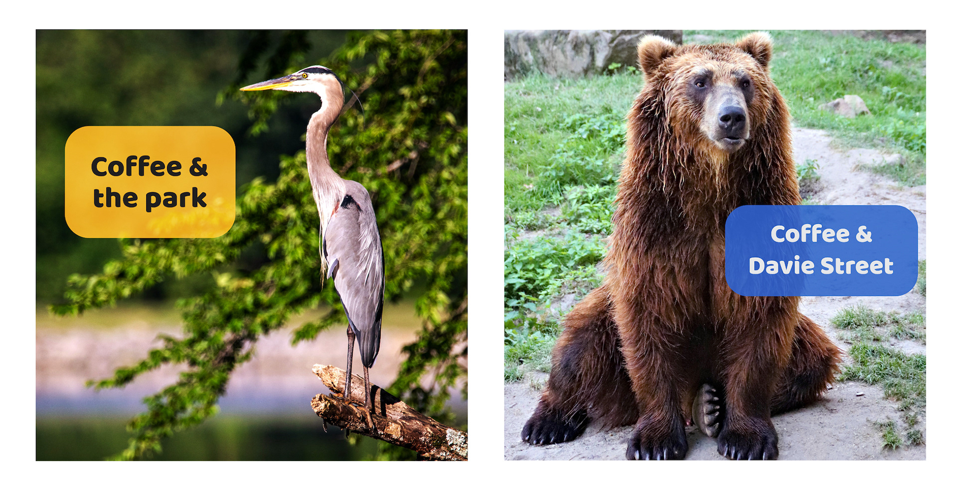
The great blue heron & coyote are often spotted in and around the local Stanley Park.
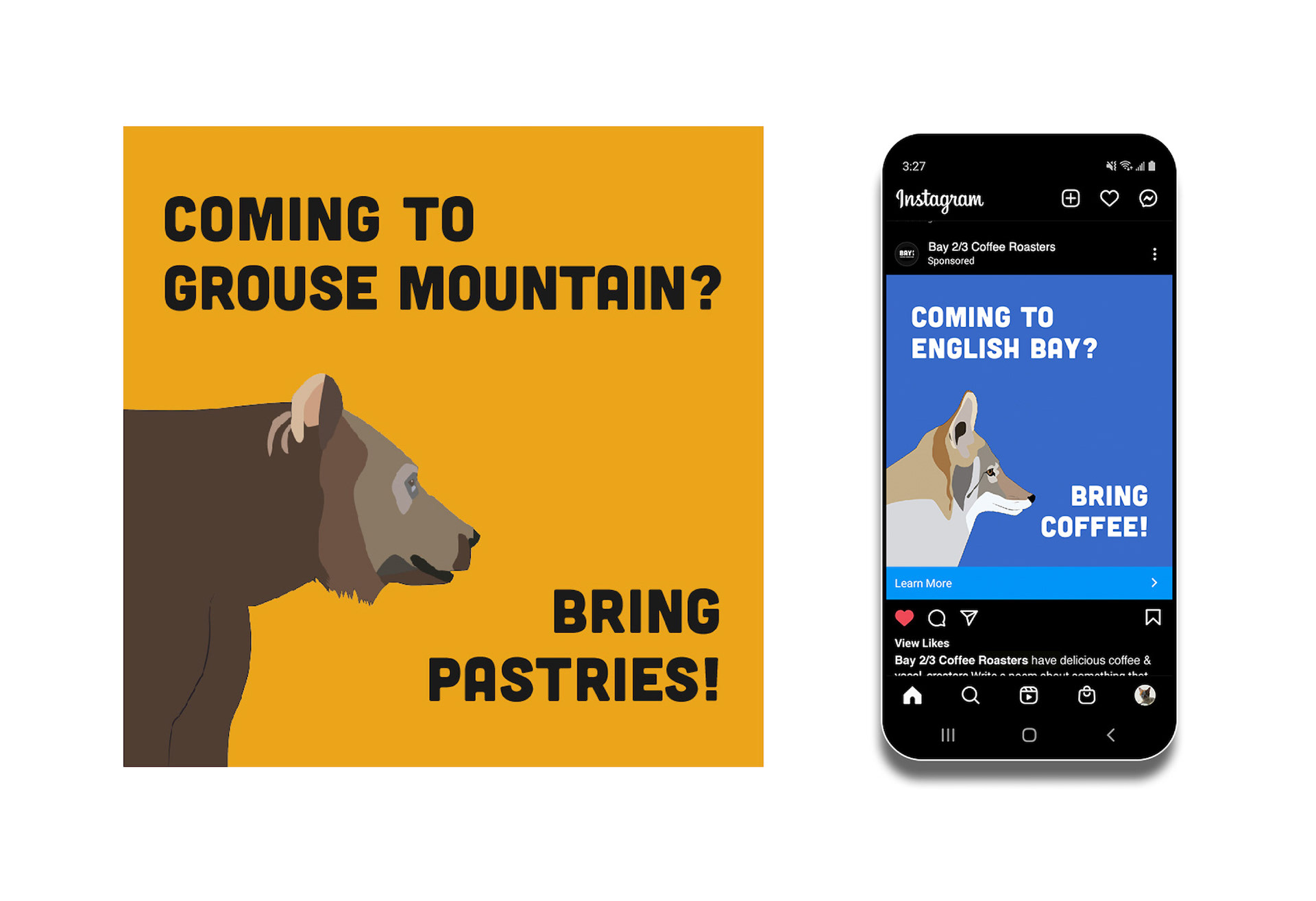
The grizzly bear represents the Davie Street area (a popular LGBTQ+ hub in the city), while also honouring one of the grizzly bears that live on the nearby Grouse Mountain, Grinder.
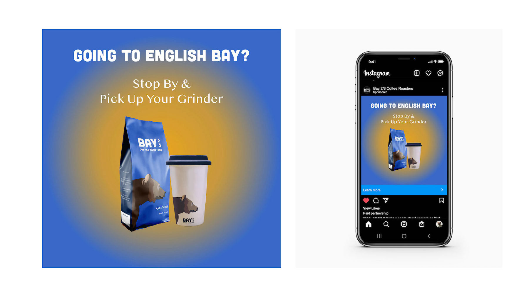
Ad concept: Using a bold background colour taken from the brand, and contrasting text; the ad tells the viewer to pick up ‘their Grinder’. The ad is referring to the Grinder character on the ceramic cup, but with multiple connotations of this word, like the Grindr dating app, or a cannabis grinder, humour and interest
is established.
is established.
2nd Ad Campaign Concept: Photograph of a Bay ⅔ brand animal, with a rectangle of brand coloured text, that has been masked into the image. Typeface 'Baloo' was used to create the rounded, inviting words and give child-like openness to the images.
The ads are striking in their simplicity, inviting the viewer to get coffee and enjoy the attractions of the West End area. As Instagram of Facebook feed ads, they would have links to Bay ⅔ social sites, allowing the viewer to find out more.
3rd Ad Concept: Using the illustrated characters and brand colours to promote brand recognition, these simple ads are effective at drawing the eye in both print & social media design. The tag-lines are telling the viewer to 'bring coffee & pastries', using familiar language to show the value that Bay 2/3 Coffee Roasters brings to visiting tourists of the West End area.
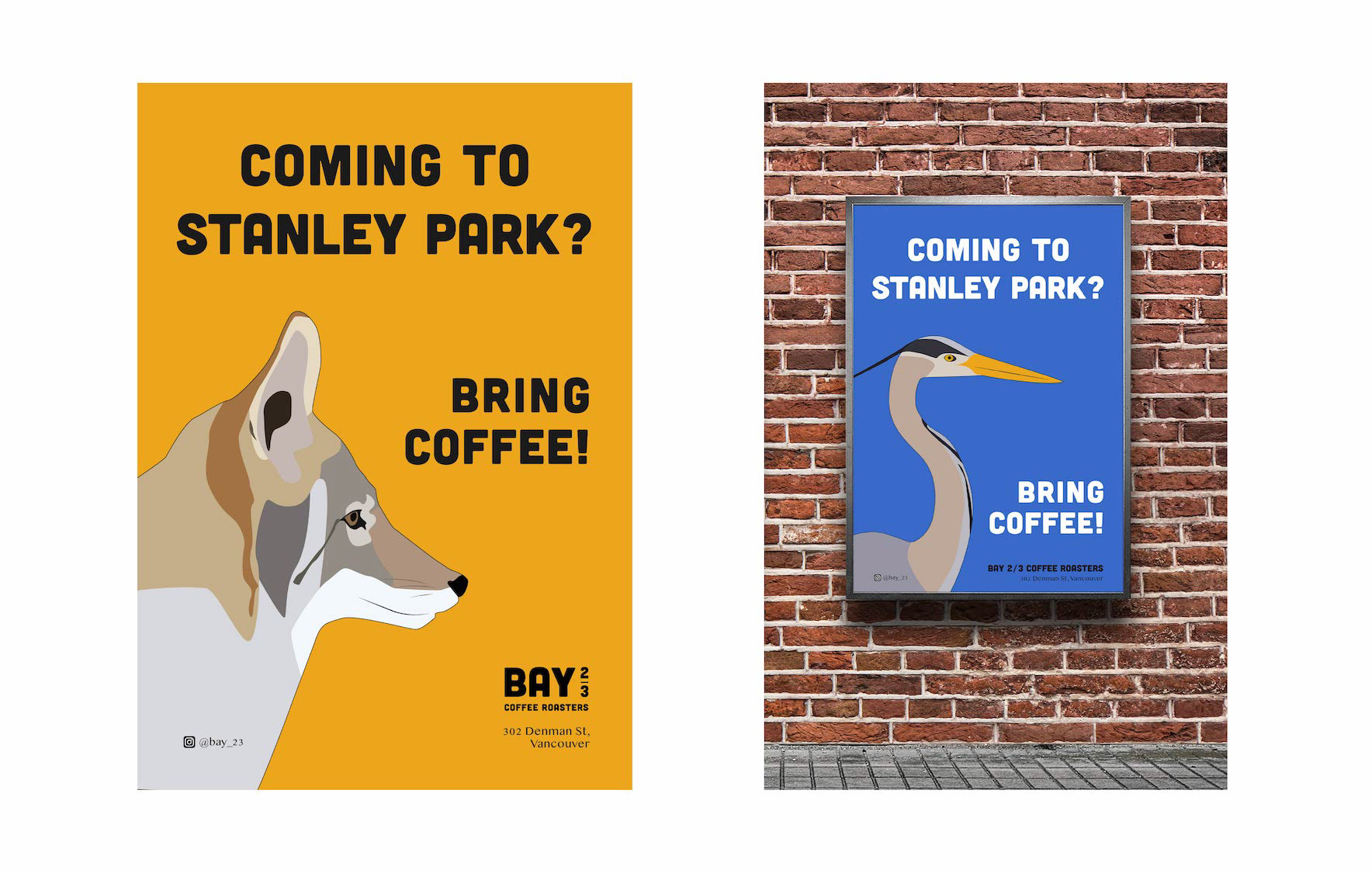
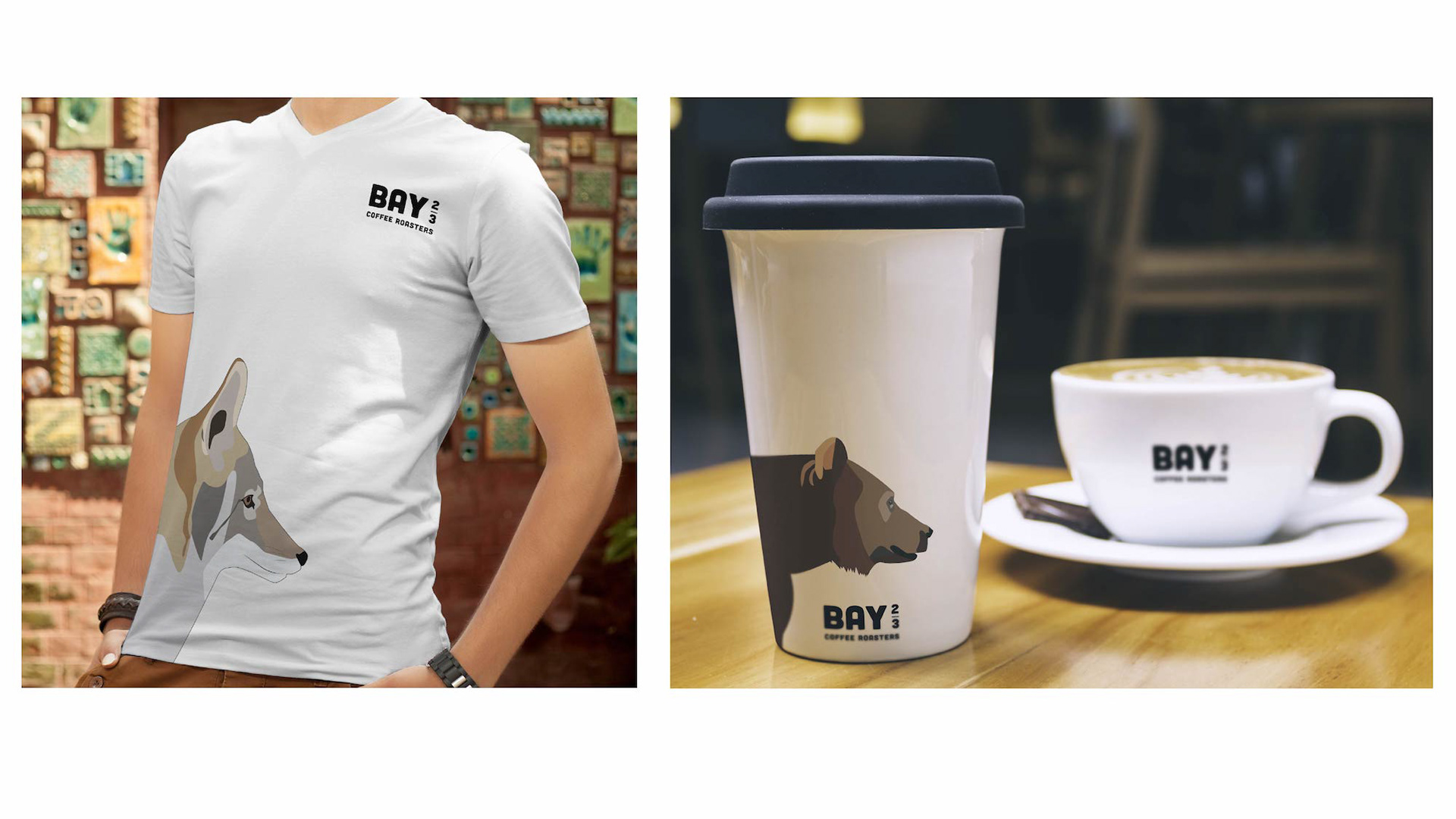
The striking illustrations easily allow for branded accessories that can be sold at the coffee shop.
Programs Used: Adobe Illustrator & Adobe Photoshop